

Portuguese Republic Centennial

FBA was responsible for designing the logo used to mark the Centennial of the Portuguese Republic.
The National Committee for the Commemoration of the Centennial of the Portuguese Republic wanted a logo translating the values of this political system that Portugal has lived in during the last century.
This was our starting point.
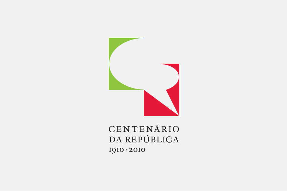
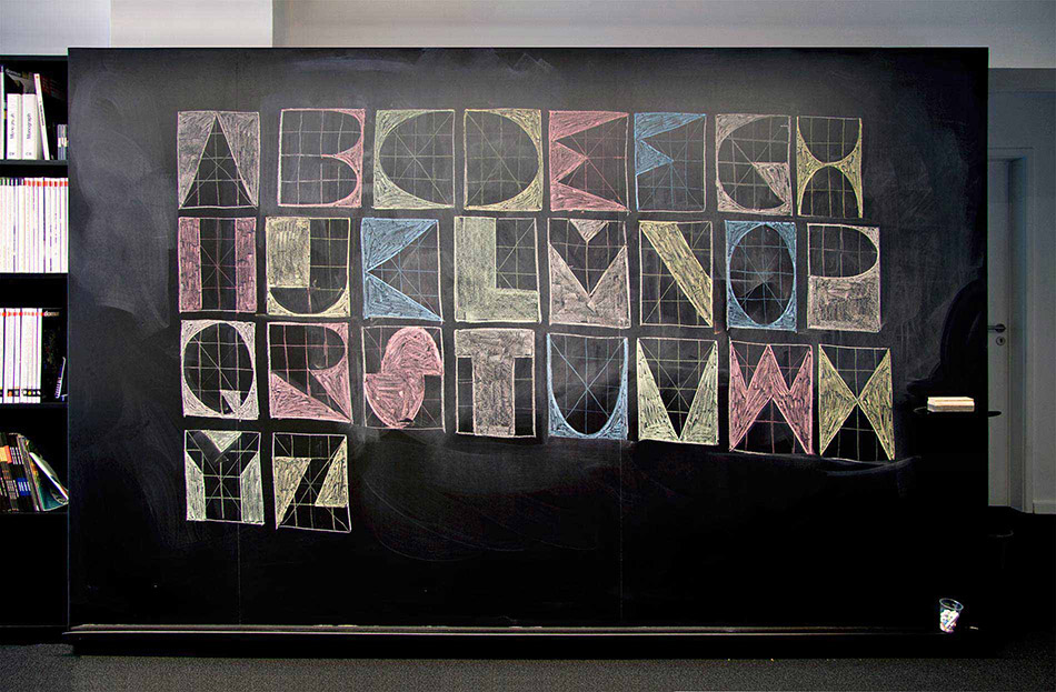
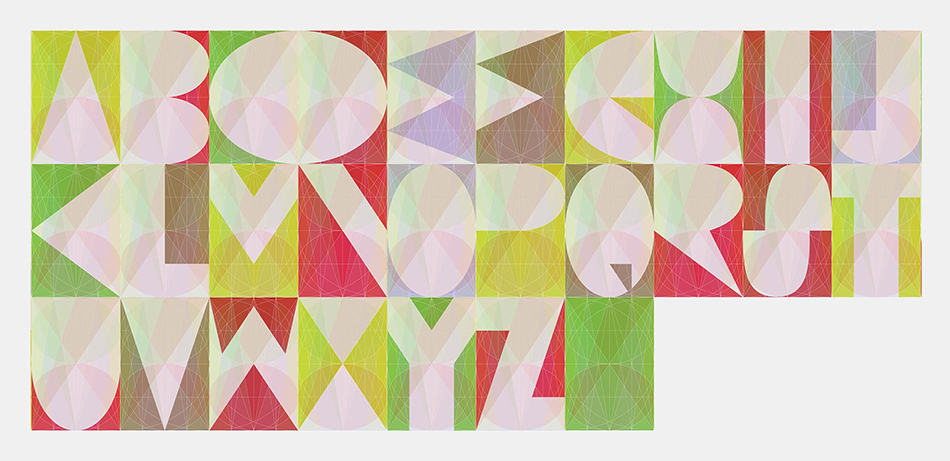
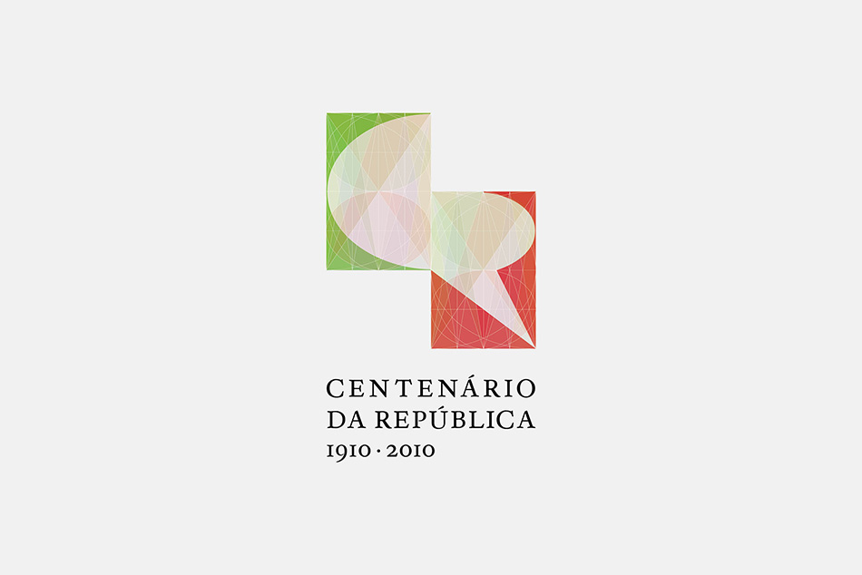
More equitable and widespread access to education for all was recognized as the most striking aspect of this republican experience, which has enabled almost everything else. The people, once illiterate, are now represented by an alphabet. Each letter as an individual and the alphabet as a society, organized within a grid - the Republic - which, at the same time regulates and enables both individuals and groups in equality.
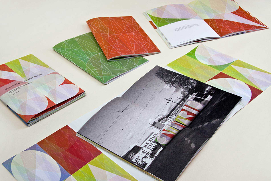
The two letters "C" from Centennial and "R" from Republic were built within this grid, forming a 'speech bubble' when placed side by side, a symbol of dialogue and freedom of expression in democracy. The colors are adopted from the Portuguese flag and the bespoke typeface "Republic" is by Hugo d'Alte, a Portuguese type designer.
The National Committee for the Commemoration of the Centennial of the Portuguese Republic wanted a logo translating the values of this political system that Portugal has lived in during the last century.
This was our starting point.
More equitable and widespread access to education for all was recognized as the most striking aspect of this republican experience, which has enabled almost everything else. The people, once illiterate, are now represented by an alphabet. Each letter as an individual and the alphabet as a society, organized within a grid - the Republic - which, at the same time regulates and enables both individuals and groups in equality.
The two letters "C" from Centennial and "R" from Republic were built within this grid, forming a 'speech bubble' when placed side by side, a symbol of dialogue and freedom of expression in democracy. The colors are adopted from the Portuguese flag and the bespoke typeface "Republic" is by Hugo d'Alte, a Portuguese type designer.
Client
Comissão Nacional para as Comemorações do Centenário da RepúblicaYear
2009Design
Ana Boavida, João BickerComplementary Type design
"Republic" by Hugo d'AlteDigital animation
Pedro CruzPhotographs by
Daniel Santos