Portuguese Presidency of the European Union 2007
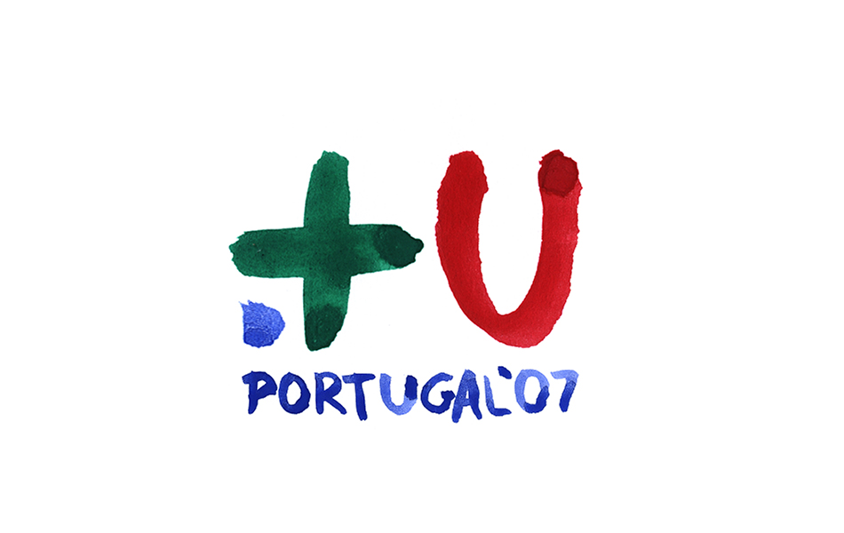
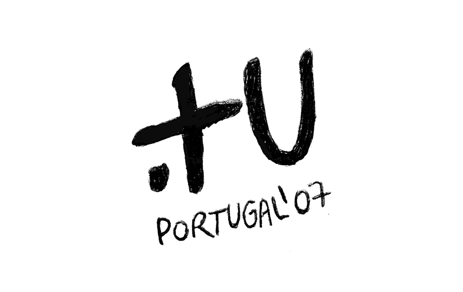
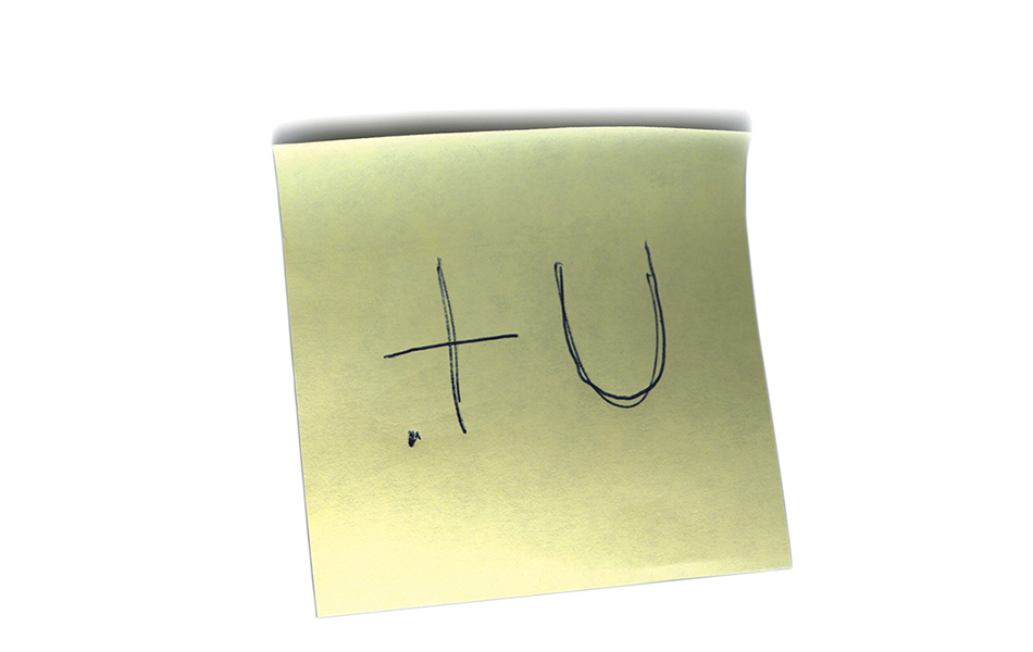
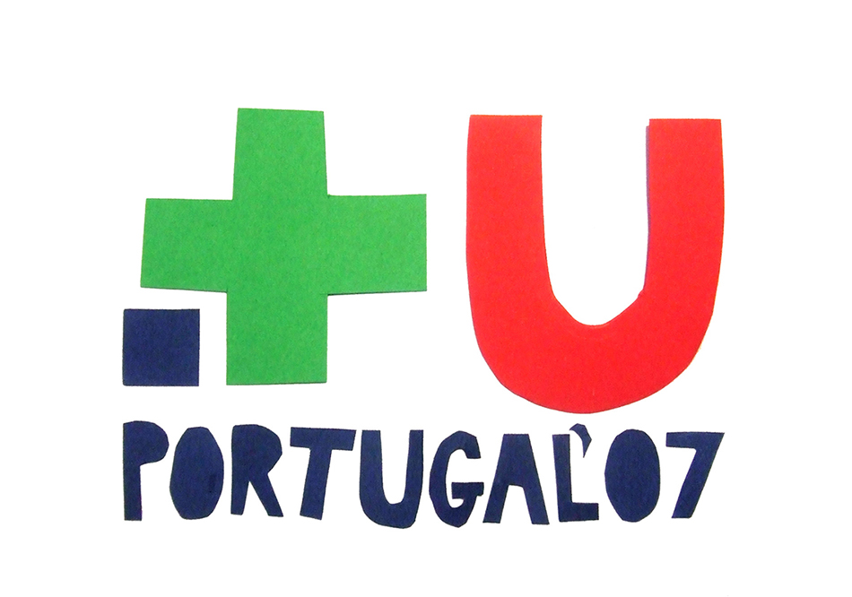
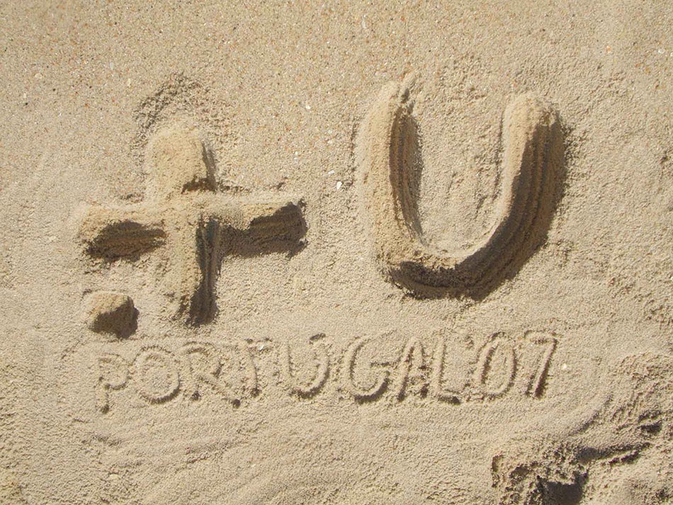
This bid was submitted by FBA in response to an invitation from the Portuguese Design Centre to develop the visual identity for the Portuguese Presidency of the European Union. FBAs bid came in second place.
In 2007, the Portuguese Presidency of the EU Council was to be held under the aegis of EU enlargement and the political intention to promote sustained economic development based on technological innovation without forgetting the strengthening of social solidarity in the wake of the Lisbon Agenda.
On these assumptions, the identity we developed articulated several principles:
- it was based on the graphic simplicity employed in recent communication technologies, whose main features had become common on mobile phone sms or on e-chat applications;
- use of the mathematical symbol of 'union', taking advantage of the universality of the mathematical language, and evoking the technological dimension of the presidencys agenda,
- a third element consisted in the grouping of elements of the symbol as constituting a community, as a whole, the symbol is similar to an Internet domain name that acts as a metaphor for a community of users, citizens of the union.
The simplicity of the symbol tried to provide answer to two programs of great complexity: on the one hand allowing it to act as an acronym for 'more union' and secondly, facilitating ownership and usage with the consequent possibility to be used on very different media.
The graphic symbol is at the same time a message. Symbol and message are mutually reinforcing the identification of the Portuguese Presidency of the EU Council, acting as a statement of principles on a European project that exists because of the citizens and for the citizens: 'more unity, more citizenship'.


